Monday, June 16, 2014

Reflective Statement

Relevance of work to proposal:

This semester I have pursued the investigation of apocalyptic, dystopic and utopic imagery. I wanted to investigate the reasoning and theory behind this imagery both in historic and contemporary times, and either enhance or undermine our reading of recurring signifiers and motifs by their presence in landscape arrangements. The final works are relevant to my proposal as I have directly addressed these ideas and reinterpreted the images and text I researched from film, television and written sources, but has evolved from my original title of Before the Apocalypse to become Apocalypse, Dystopia, Utopia - A Study to not only present but deconstruct such notions.

Conceptual development:

My ideas have developed this semester from wishing to depict the stages of apocalyptic development as mutually exclusive temporal events, to bringing the motifs and signifiers together in a simultaneous staging. Originally, I intended to depict the distinct settings of the foreshadowing of an apocalypse, the event itself, the immediate aftermath, and then visions of what we imagine rises from the ashes. However, from reading the theoretical ideas of Margaret Atwood I realised that there cannot be a utopia without elements of a dystopia, or a dystopia without elements of a utopia. Hence, I realised that these ideas are not mutually exclusive, and developed an artistic curiosity as to how the incorporation of apocalyptic imagery also would affect the reading of the final works in a visual confusion. As ideas that have no basis in the real and only exist in art, they are also subjective. Therefore, my depiction of the ideas underscores artificiality and deconstruction, asking the viewer to question the basis for such thoughts and undermine their supposedly ‘sublime’ nature. I also became engrossed in the writing of 17th century poet John Milton, using passages from his text Paradise Lost to investigate another potential form of landscape through the literary dimension, and play with the use of colour as an intervention towards the gravitas of the subject matter.

Technical development:

My technical development this semester has involved refining my presentation of my painting maquette to allow it to stand alone as a finished artwork. The choice to leave Apocalypse, Dystopia, Utopia ­– A Study unfinished became one mainly based on time constraints, however I also enjoy the conceptual result that has ensued. It means that the works are dependent on each other for their reading and interpretation – one cannot be fully understood without another – and thus it has become a physical manifestation of my thematic ideas. I enjoyed both painting in black and white and colour, and playing with a range of materials including paper, fibre and foam to create a dioramic representation of conflicting symbols, with the medium itself also contributing to the concept of artificiality.

Personal Evaluation:


This semester I believe that I have achieved a series of works that successfully reflect my conceptual ideas and have additionally allowed me to experiment with aesthetic ideas. To further my practice, I would like there to be more interaction between the two and three-dimensional elements I create, and more experimentation with their identity and dependence on each other. I intend to further this work by continuing my research on the signifiers of the utopia, rather than such a concern with dystopic and apocalyptic imagery.

Development of Work


Having now finished the painting of all my text works, I can now reflect on the process I chose to make each panel. My intention was that these works would argue the nature of landscape paintings and would challenge the imagery-based motifs and signifiers that I was incorporating into my dioramic work. I think next time I would leave areas of each panel unpainted, as whilst I like that the umber ground is visible to some extent under the coloured paint layer of the background which does give some spacial depth to the work, I really liked the aesthetics of them when they were partially painted and I like that this creates a sort of visual decay appropriate to the ideas of the apocalypse. An original idea for the display of my text works was to twist the positioning of each panel on the wall so that they all sat at angles to each other, and the viewer would have to twist their neck this way and that to read the words. However, I now think that idea is a bit gimmicky and doesn't add anything to the concept of the work, so I will display each panel in order, hanging straight. I plan to position the panels so that they can be read chronologically as a story, however as each excerpt was taken from all different places within Paradise Lost, my ordering is a new interpretation of the poem and resultantly, a new narrative.


To accompany the painting of the diorama, I kept working on the grid paintings, now finished. As the grid was created using random number generation it was impossible to dictate what the final image would look like, however I think perhaps next time I would eliminate the white and work only with greys and blacks. This is because when I made my graphite studies every single square was a shade of grey, and I seem to prefer this aesthetic to a complete greyscale, with the white. I think the panels I have painted still work with the diorama painting as it does involve white so the grids work as pixellations and deconstructions of other potential images in the series. I made a choice to keep an area of each panel masked so that in the end there would be a strip of exposed wood. This is because I wanted there to be some element to the painting that broke the illusion of it being a window to another reality, and highlight the fakery behind the ideas. I also just really love the aesthetic of timber, and thought the warm colour and brown complemented the fact I decided to paint these three dependent works in black and white.


I am disappointed that I ran out of time to better refine my painting of the diorama, however I am happy that the diorama was completed and stands alone as an artwork in itself. I am also happy with the conceptual result this has ensued as it means that the painting and diorama are dependent on each other for their reading and interpretation - one cannot be fully understood without the other - and thus the painting itself has also become a physical manifestation of my thematic ideas.

Ideally, I would like this work to be displayed along a long, blank wall, allowing the viewer to step back from the 'landscapes' and view them as a pictorial whole. To display all these works now I intend to have the diorama and painting facing each other on opposite sides of the studio space, with the text works separating in the middle. This means that the diorama and painting will not be too close together and cannot be viewed at the same time as each other. I hope this will mean that the viewer interacts more with the work and will be more interested in understanding the conceptual message of it as to why there is both a physical and two-dimensional version of the scene, rather than seeing the two works next to each other and just considering one a back-up maquette and the other the real final work.


Tuesday, May 20, 2014

The Chapman Brothers


Rhizome, 2000, mixed media, 36 x 98.5 x 98.5


The End of Fun, 2010, mixed media


Hell, 2000, mixed media


The Sum of All Evil, 2012-2013, mixed media


Unholy McTrinity, 2003, painted bronze, 180 x 210 x 60 cm

I really enjoy looking at the work of Jake and Dinos Chapman because of the exquisite craft behind what they make. Often, the Chapman brothers create tiny scale models although these models are epic in scale and detail. This enrapturement due to wondering about the processes behind the artwork creation is exactly what appeals to me about making dioramas and then painting from them myself. A further similarity in artistic concerns between myself and the Chapmans is the themes they explore which I would postulate can be defined as dystopic. Often the Chapmans work with war and Holocaust imagery paired with the corporate icons of our generation (particularly McDonalds) to reflect on the universal trends of society. This imagery is commonly vivid and explicit, however the Chapmans are successfully able to bend it into parody through scale. As I would also like there to be some element of parody behind my work I am very much inspired by this use of exaggeration. I like that their work is both conceptual and representational simultaneously, meaning their intended themes and ideas are clearly conveyed to their audience but are not boring and lacking in intent.

I think it is interesting that the Chapman brothers proving 360 degree views of their dioramas by constructing them within glass display cabinets, whereas I have the tendency to favour one viewing point for my dioramas. Whilst I love that in the case of the Chapmans, the viewer has the chance to fully explore their work from all angles which allows for new discoveries of what the work contains, I think it is important for me to continue boxing in my imagery at this stage to continue exploring the relationships between the 3D and 2D and therefore the transition from space to the picture plane.

Monday, May 19, 2014

Diorama Development


I'm really happy to have been able to finally start on the diorama I intend to paint from. I am going to create quick craft replicas of the motifs I have been researching all semester, collage them together into a scene, photograph the scene and then create a painting. I am keen to emphasise the artifice of my construction, particularly by revealing elements of the construction process such as making the walls of the diorama visible and painting in the flaps in the paper background. So far I have made a 60 x 36 cm room box out of black foam core which is adhered together using PVA glue. I then found a generic image of a sunset (link), and printed it out in sections using A4 copy paper. I have stuck these on the background using folded over pieces of masking tape, resulting in an intentionally slightly textural and wonky finish. I also added a supersized moon as I think it creates some degree of eeriness and contributes to the apocalyptic imagery. The goat was made by creating a wire armature wrapped in pipe cleaners and then felting wool fleece onto it. I also sewed on two small black beads for eyes, and embroidered a black nose using embroidery cotton. At this stage I have just stared to construct the trees by painting cardboard tubes brown, and I will then add green tissue paper and possibly pom pom fruit. I still need to start making rocks using expanding foam, one of which I would like to sculpt into the suggestive shape of a skull, sew a small felt moth, create a portion of a monolithic structure and some barbed wire fencing to surround it, and reflect on any other elements I feel the diorama requires. So far I am happy with how the construction is coming together, however time restraints are beginning to affect what I can achieve so I will need to keep in mind just how detailed the diorama can be.

Saturday, May 17, 2014

Paul Sloan


Primarily, I wanted to have a closer look at the artwork of Paul Sloan because I noticed his use of repeated skull imagery, but I found it interesting to read on his website that ideas of the apocalypse and dystopias/utopias are not consciously incorporated into the work. Sloan states that his inspiration comes from a variety of sources, such as "light in the Australian landscape, our relationship to natural history, found images of social uprising, revolt, revolutionary activity and points of flux [and] the relationships that exist between music and art" (Paul Sloan About), but whilst I am not pursuing any of these themes, I can still see parallels between his art and my own. I like the way that Sloan works across a range of mediums, incorporating drawing, painting, sculpture and photography in various ways. I like that he employs the appropriate medium for the idea behind specific artworks he wants to make, which highlights the need to be adaptable and experimental in how to convey the message right. It is interesting to see the aesthetic differences in his practice, such as the looseness of his gouache paintings compared to the atmospheric moodiness of his photographs. I think this is the strongest message I take away from looking at what he has made - that it is okay for me to work between mediums to find what is specifically relevant for what I want to make. I like how he has represented the skull both through an actual object and the representational image of one, and I particularly enjoy the way his painting of the skull is abstracted and minimised. I would like to use a similar representation of a skull in my diorama in that it will be suggested, but not meticulously replicated. I also enjoy Sloan's largely monochromatic and naturalistic use of colour, which encourages me to continue working with black and white although I could probably experiment more with how precisely I am trying to paint.

Friday, May 16, 2014

Pixellation Development


After the small sketches I made of pixellation studies I wanted to get on to making larger versions to accompany my diorama painting. Just as with the text-based paintings I wanted to begin with an umber layer so that there would be some depth in the layers of the work and also to assist in seeing what areas have been painted in or not. I generated the ordering of the squares by using a random number generator. Starting at the top left hand side, I generated numbers between 1 and 10, re-doing the generation if I got the same number twice in a row. So far I have only painted in the white squares (number 1), but I am going to work my way through a range of greys (numbered from 2-8, increasing in numerical darker the more black that will be added to the mix), before painting in the final black squares (number 10). I am painting from light to dark for the practical reason that working with wet paint the colours may smudge together a bit and it will be better to accidentally mix a small amount of a lighter colour with a darker colour than a darker colour in with a lighter colour. I have taped the bottom of the work by about 10 cm so as to keep a section of the panel I am painting on as exposed wood. This is because I tend to work in a very precise and detailed manner, and I am trying to bring more elements of experimentation into the painting stage of the work. I am excited to see how this combination of finished and unfinished surface will work together, particularly because I really love the colour and warmth of timber.

Thursday, May 15, 2014

Lecture Notes - She/he's lost control again

-be brave! Embrace smudges, accidents, etc.

Generative art - process of encoding artistic idea into some sort of system
-there has to be a logic through which the artwork is generated
-system must be autonomous

su13art1531.wordpress.com/2013/07/11/71/

Surrealism - pure, psychic automatism
-artlessness - method over product
automatic paintings and drawings
Unica Zurn

Antoni Tapies - voids
Palla i fusta, 1969, straw and wood, assemblage on canvas

Cy Twombly
-mass of mars, erasures and words
are smudges intentional or accidental?
-respond to the specific needs of each work?

Les Moutons de Panurge - Frederic Rzewski

Basquiat - informed his work by trying things outside the realm of painting, e.g. dj-ing
-paintings are experimental jazz rhythms?
Brother's Sausage - 6 hinge panel - everything is revealed
small drawings controlled, paint splatters loose and free
-appropriation from all sorts of sources

Ghada Amer - embroidered paintings
thread ends adhered to canvas using gel, technique akin to paint dripping
control of embroidery + loss of control of thread ends
La Ligne
The Black Bang - reference to male artists

Tracey Emin
I Can't Believe How Much I Loved You
-don't give everything away in your painting - there has to be something for the viewer to imagine
Keep Your Darkness Away - embroidered calico

Susan Hefuna
-ink and pencil drawings, multiple layers of tracing paper
-networks and systems
NOTATIONOTATIONS - choreography and drawing - mapping of people

Thursday, May 8, 2014

Text Development


This is some of the progress I have made so far with the text based works I am painting. I have chosen to paint them over the top of a burnt umber ground as it means that when the final colour goes on, it has some depth and textural interest through the ground being visible still to some extent. I am liking aesthetically how the works are looking even before I paint on the background colours, and I think if time were permitting I would not only experiment with doing black and white paintings but also sepia ones. I am finding it to be quite a lengthy process to do each of these paintings as it takes a while to transfer the text and also paint it in so finely, but I also consider it quite a meditative process of almost colouring in. At this stage I am eager to finish these paintings completely so I can reflect on how they are working together, and also be able to fully dedicate my time to working on the diorama and getting the painted version of it started.

Tuesday, May 6, 2014

Ricky Swallow

I can see parallels between the work of Ricky Swallow and my own as there is an evident obsession with craft in his highly skilled wood carvings. There is also the similarity of subject matter, as Swallow deals with vanitas imagery, particularly in his repeated use of skulls. I really think Swallow's work is pursuing the idea of replicating motifs which symbolise death and mortality but in a corporeal form which will last for years. Therefore, there is the concept of making manifest the ephemeral, an idea I intend my diorama's to convey as the notions of the apocalypse and even utopias and dystopias only exist in the arts, so making a physical object of them creates a dialogue between concept and execution.

I like that whilst many other artists that I have looked at because of their consideration of vanitas imagery have been painters, Swallow is one of the first who has done so quite explicitly as a sculptor. I can therefore see the clear relevance of his work to mine in the making of the 3D, although I then intend to transport this into the 2D plane of the painting. I think what I most take away from studying his work is the effectiveness of minimalism, particularly in the sense that most of his work takes advantage of the natural colour and stain of the wood he has used. I believe this monochromaticism allows the details of Swallow's work to be properly appreciated, therefore I am encouraged to pursue using a limited palette in my own work.


Everything is Nothing, 2003, Jelutong, epoxy putty, 21 x 32 x 14 cm


The Exact Dimensions of Staying Behind, 2005, English limewood, 70 x 110 x 105 cm


The Arrangement, 2004, English limewood, 115 x 46 x 51 cm


Come Together, 2002, Jelutong, 66 x 64 x 81 cm


Younger Than Yesterday, 2006, English limewood, 20 x 20 x 20 cm

Tuesday, April 22, 2014

Brave New World


Brave New World, based on the book by Aldous Huxley, describes what could possibly be interpreted as a utopic society where everyone's desires are fulfilled and inconveniences are non-existent. The book and telemovie are set in London in 2540 AD, or 632 AF (After Ford). Characteristics of the society are a stable population, where children are created by chemicals and machines rather than mothers and fathers, a caste system where each person is conditioned to be contented with their social strata, recreational sex is encouraged and the norm whereas family ideas and monogamy are forbidden, each person takes a daily rationing of soma which reduces all their emotional needs, and being alone with ones self is forbidden - only sociability is allowed. However, the cracks within this seemingly perfect social structure are revealed when an outsider gains access. Living in tandem with these "advanced" societies are the Savage Reservations, where life does not rely on drug-induced satisfaction and social norms more closely reflect our conditions today except for their tendency towards self-mutilation and cult religions. It is an interesting point of discussion in the story as to which of these is the utopia and which is the dystopia - neither is without issue and the very simultaneity of their existence perhaps underlines the ways to go before true societal perfection can be achieved.  

Motifs: Humans in uniform vs. humans in cloth and hide, Futuristic buildings and architecture, Rubble, Wild and hostile landscape


Saturday, April 19, 2014

Children of Men


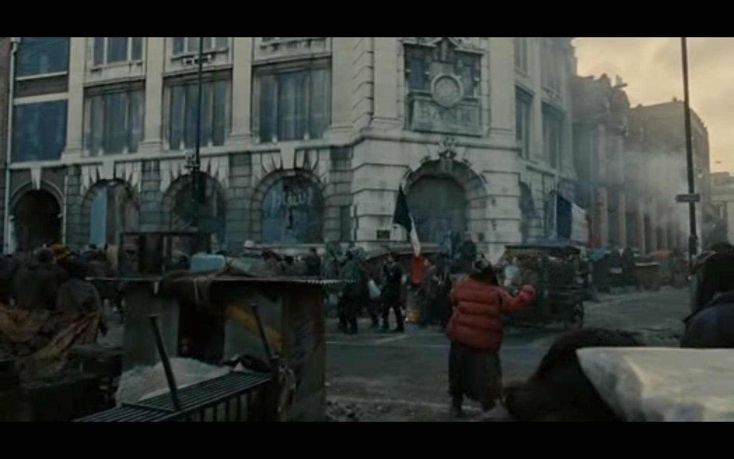
Children of Men is set in the year 2027, a new world where women have become infertile and science has failed to discover the reason. Illegal immigrants seek sanctity in the UK, but are rounded up like cattle and forced into the squalor and danger of refugee camps. The protagonist, Theo, works an unfulfilling office job in a constant state of misery, but due to a series of events finds himself reluctantly escorting a pregnant West African refugee, perhaps the only pregnancy after two decades, to escape to the sanctity of the elusive and almost mythical Human Project. The film is dystopic in the sense of there being an oppressive political regime in place with violence and depravity wide spread amongst the people. It is an interesting exploration of a possible future where the collapse of mankind is imminent and known consciously by all people, so questions what we have to live for in that context and how or even if we can retain our humanity. It asks if there is the possibility of hope in the face of overwhelming futility and despair. I really enjoyed the film for its wide and continuos single-take shots, conveying a sense of scale and magnitude just as successfully as the scenes depicted by the Romantic painters but in a contemporary sense.

Motifs: monochromatic palette, fog/smog, flames, graffiti, rubble, helicopters, cars, monolithic structures, fencing/barbed wire, guns, trees